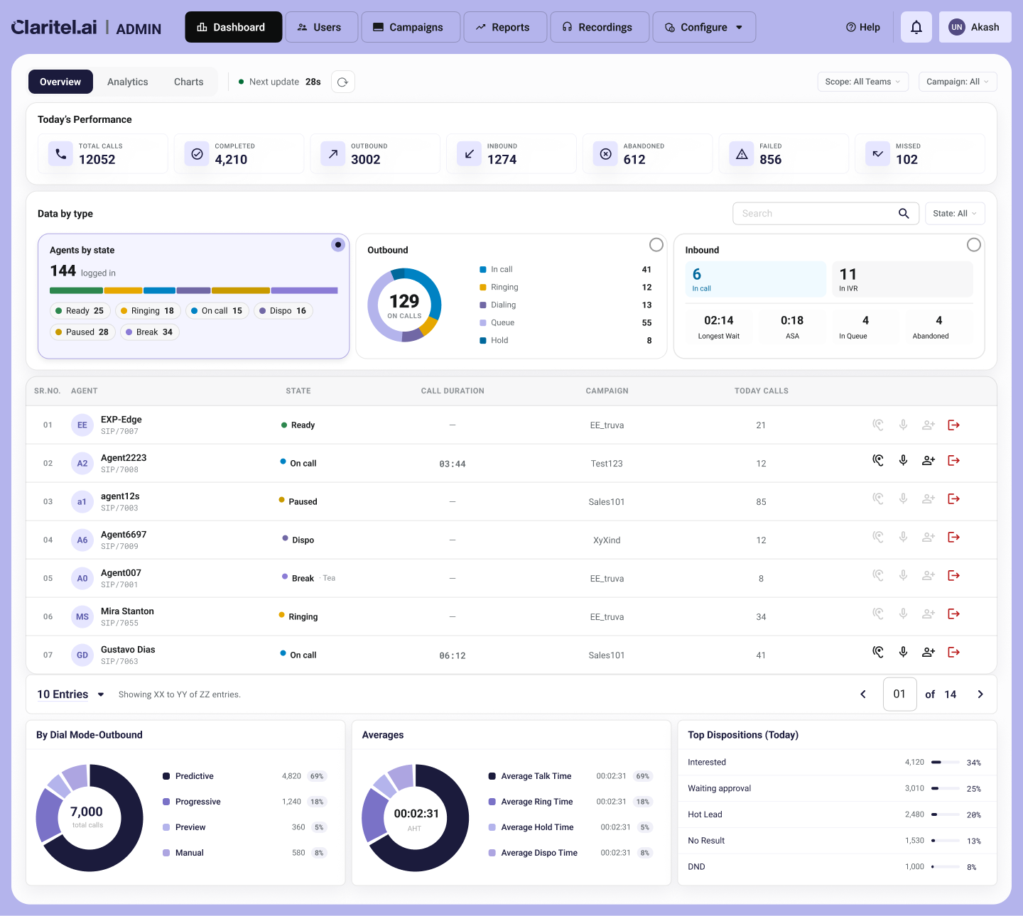
- Spent this week redesigning the real-time dashboard for our contact center product. thought it'd be a UI job. it wasn't. the actual problem was that the customer and the engineer wanted opposite things and both of them were right, which is the worst kind of problem to have.
- The customer is BFSI, outbound-heavy, and every demo they'd add one more thing to the list. how many calls are live right now. how many done today. abandon rate. who's on break vs actually on a call. AHT, talk time, hold time. dispositions. the dial mode split.
they didn't want a metric. they wanted the whole board, live. and honestly for collections that's the right instinct — the job is knowing what's happening this second.
- Engineer looks at the same list and goes: this will melt the DB.
which, fair. every number is a query, the screen refreshes roughly every 28s, so it's not a page load, it's the same query storm firing on a loop forever. he wasn't being difficult, he was right too.
- So now I'm stuck. give the customer everything and I've handed engineering a system that falls over. give engineering the relief and I ship a dashboard so thin it answers none of the questions the customer actually cares about.
took me a bit to realize the mistake was treating "the dashboard" like one thing that refreshes at one speed.
- It doesn't have to. so I sorted every number by how fresh it actually needs to be.
the vitals up top (total, completed, abandoned, failed) are cheap reads, those stay live. the state cards — agents / outbound / inbound — only one's open at a time, not all three polling at once. and the heavy stuff at the bottom (averages, dispositions, dial mode) is aggregation over history, so it's allowed to lag a little. nobody's making a call based on whether avg talk time updated 3 seconds ago.
- That bottom row is where it clicked.
"it's slow" was never actually true. "this specific aggregation is slow" was true. and once you say it that way the fight kind of disappears — because the live stuff the customer wants most is the cheap stuff, and the genuinely expensive queries are the historical rollups, which are exactly the ones that don't need to move every 28 seconds anyway. so they don't.
- One thing I wouldn't budge on: if I can't tell you where a number comes from, it doesn't go on the screen.
Call duration only shows on live calls. everywhere else it's a dash. not a fake 00:00, not a padded zero. no SLA gauge, no pause-reason card, none of the stuff every competitor dashboard has that our system doesn't actually track yet. a screen that looks full but shows nothing real is the last thing you want to hand a compliance buyer.
- End result is the layout in the pic. customer gets the full live board they'd been asking for. engineer gets a hard ceiling on load. nobody had to lose.
The thing I keep thinking about is that neither of them was wrong, the disagreement was just happening at the wrong altitude. the whole fix was buried inside one word everyone kept using too loosely — "slow."