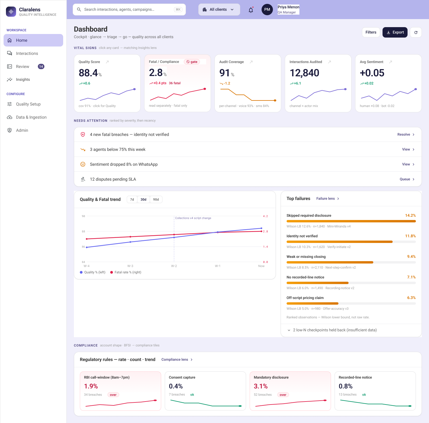
Initial approach. The brief was the one every designer knows: research the best quality dashboards, study what the category ships, design the strongest insights page I could. So I did — benchmarked, collected patterns, had a good-looking page forming.
Where it broke. Midway I stopped trusting the dashboard heuristics. A dashboard isn't a gallery of the best-looking charts; it's the front end of a decision. The question that mattered wasn't "what should this page show" — it was "how does a user analyse this, share it, and act on it, and how does my presentation decide which of those they can even do." Framed that way, half of my well-researched page was decoration.
Resolution. I anchored the insights layer to an analytics lifecycle — Ask → Prepare → Process → Analyze → Share → Act — and used it as a gate, not a diagram. The rule: an insight ships only if it names a real question (Ask) and a real decision it drives (Act). If a metric changes no one's behaviour, it isn't an insight — it's decoration, and it goes to drill-down or nowhere. That one test killed most of what research had produced. Prepare and Process became the buildability gate: data has to exist with its denominator or it doesn't ship. Share stopped being a phase-three nicety and became a v1 requirement — an insight you can't export never reaches the person who acts on it.
What I'm proudest of isn't a cleaner page, it's a mechanism. Every insight now carries the same spine — what question, whose decision, what data, what action. Most QM dashboards drown you in scoreable numbers. This one refuses to show a number that doesn't earn a decision. Fewer metrics, each load-bearing.