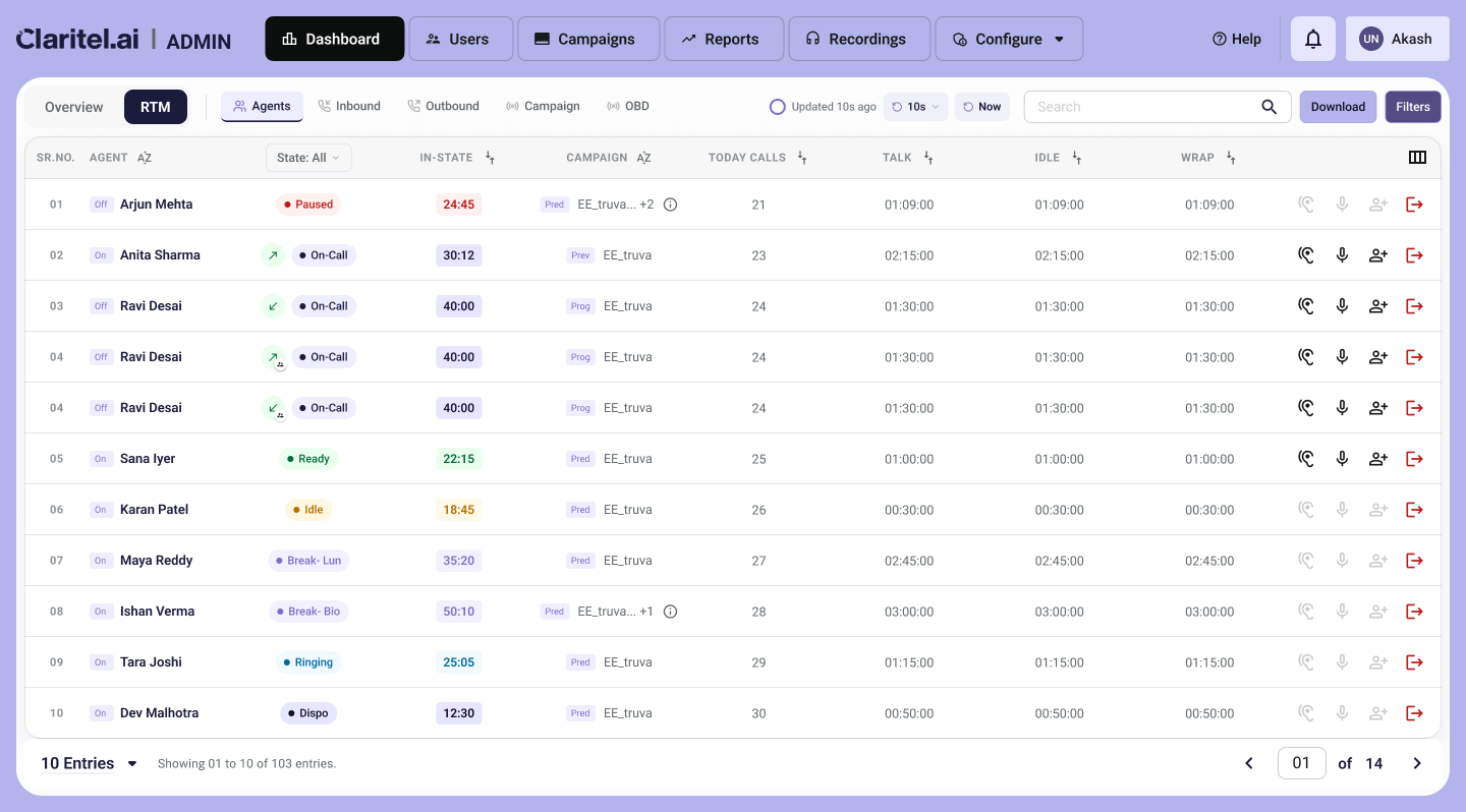
What happened: I showed clients the redesigned monitoring dashboard: an Overview tab full of charts, and an RTM tab with five sub-tabs (Agents, Inbound, Outbound, Campaign, OBD). The Overview tab got almost no reaction. RTM got all the questions.
What they actually asked for:
- Which agents are idle right now?
- Who has been on an unusually long call?
- Which campaigns have run out of leads?
- Filter inbound calls by queue status.
Supervisors didn't want to see how the day was going. They wanted to know what needed their attention right now.
What changed:
- A right-side drawer for each row in Agents, Inbound, Outbound and Campaigns, with live actions in it: Monitor, Whisper, Barge.
- Advanced filters for each tab, with an estimated record count shown before the filter is applied. Supervisors can see the size of a query first, which also keeps API calls efficient.
Workflow note: Screens were built in HTML with Claude Code first, then ported into Figma for refinement.