From Zero to Revenue-Generating MVP in 4 Weeks
How I acted as the Founding Designer to build the Brand, Design System, and Product UI that secured ₹5,00,000 in early business contracts.
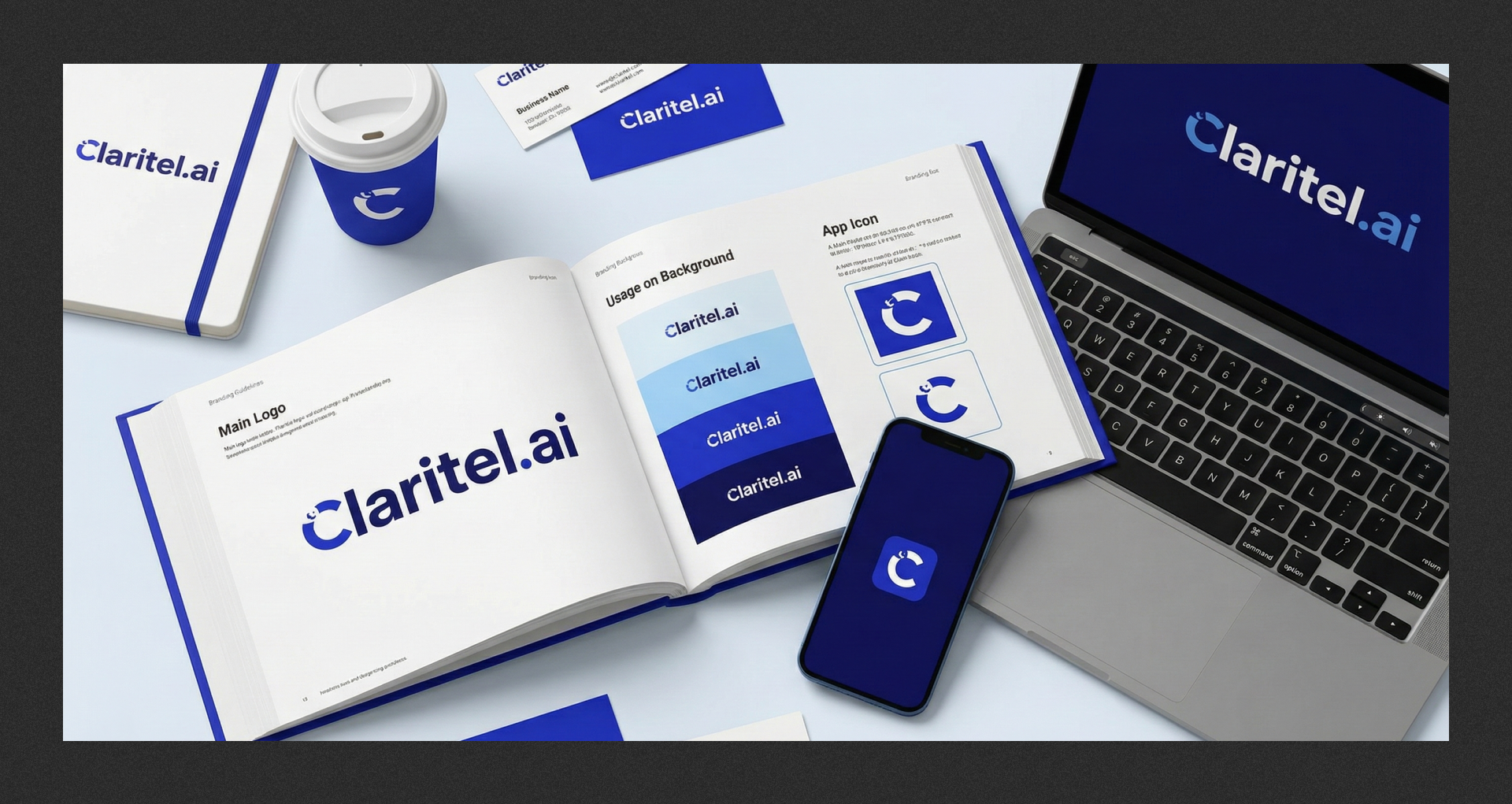
Claritel.ai
Founding Designer
MVP & ₹5L Revenue
01. The Business Challenge
Claritel needed to enter the crowded B2B AI telephony market. The barrier wasn't just functionality; it was trust. In an industry dominated by legacy players, a "startup" look is a liability.
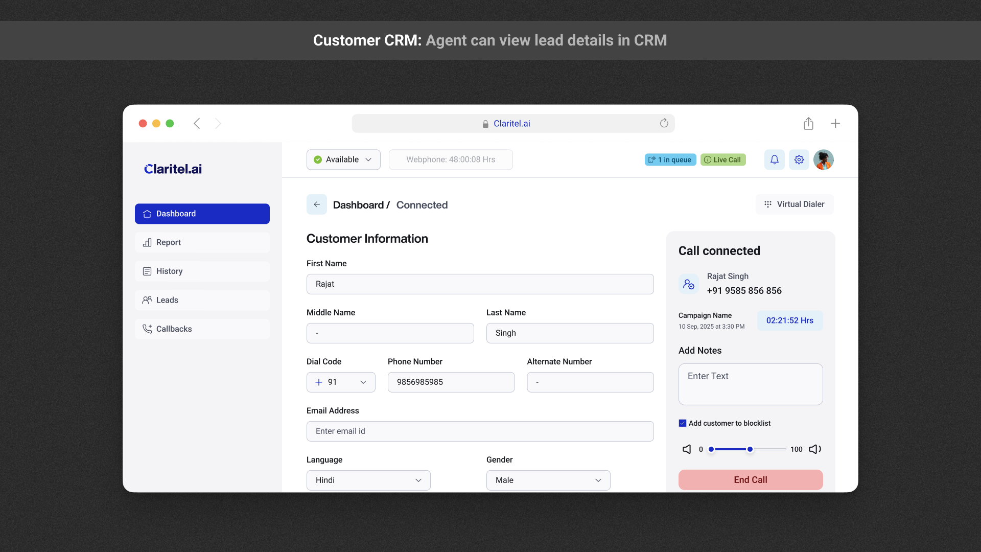
02. Solving Complexity — The "Data Density" Challenge
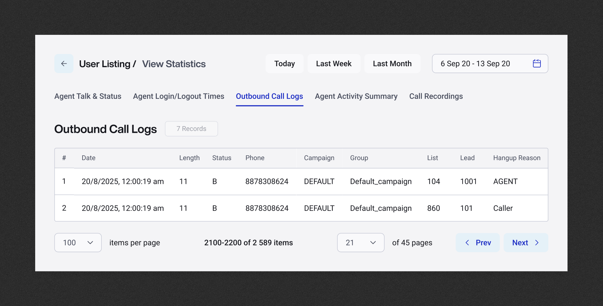
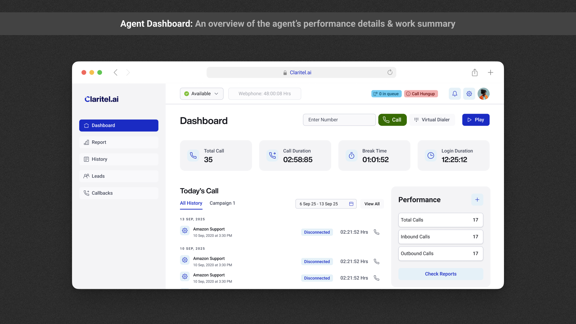
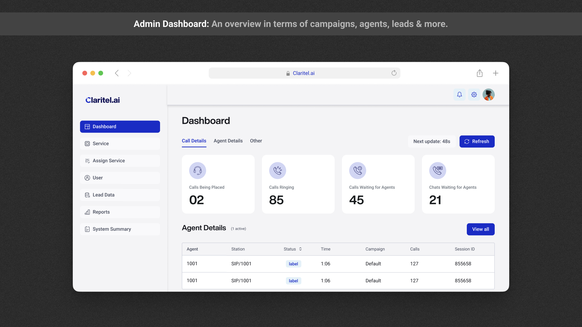
The Admin Portal is the heart of the product. The technical challenge was that Admins needed granular visibility on five different dimensions simultaneously: Real-time Status, Performance, Audit Trails, Verification, and Login Times.
The UX Problem: Displaying this much dense data typically results in a "spreadsheet UI"—cluttered, overwhelming, and hard to scan.
The Solution: Intent-Based Information Architecture
I rejected a long-scroll dashboard in favor of a Context-Aware Tab System. I mapped the user’s mental model to the interface, separating "Monitoring" tasks from "Reviewing" tasks.
03. The "Speed-to-Build" Strategy
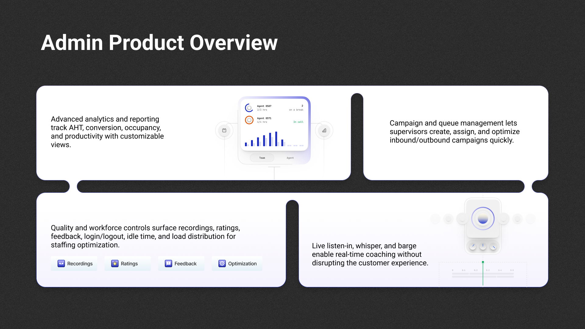
A Founding Designer must protect engineering resources. To ensure we hit the 4-week deadline, I built for implementation efficiency using an "Atomic First" approach.
- Standardized Components: Created a library of 30+ reusable components (data cards, status badges, filters) using Figma Tokens.
- Dev Handoff: Provided "Red-lined" specs specifically for edge cases (empty states, API timeouts) so developers never had to guess.
- Impact: Reduced frontend development time by ~40%, allowing us to hit the launch window.
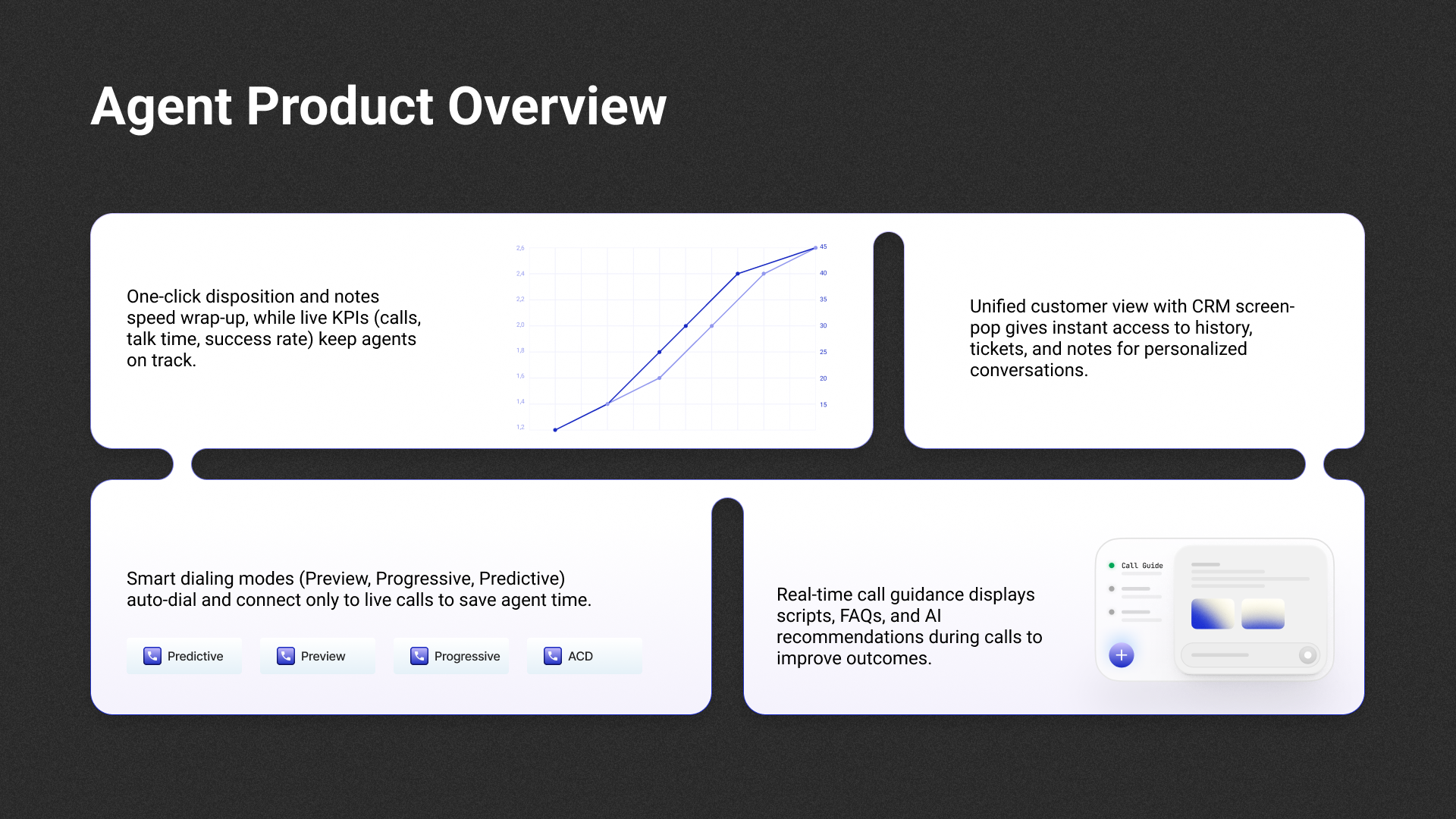
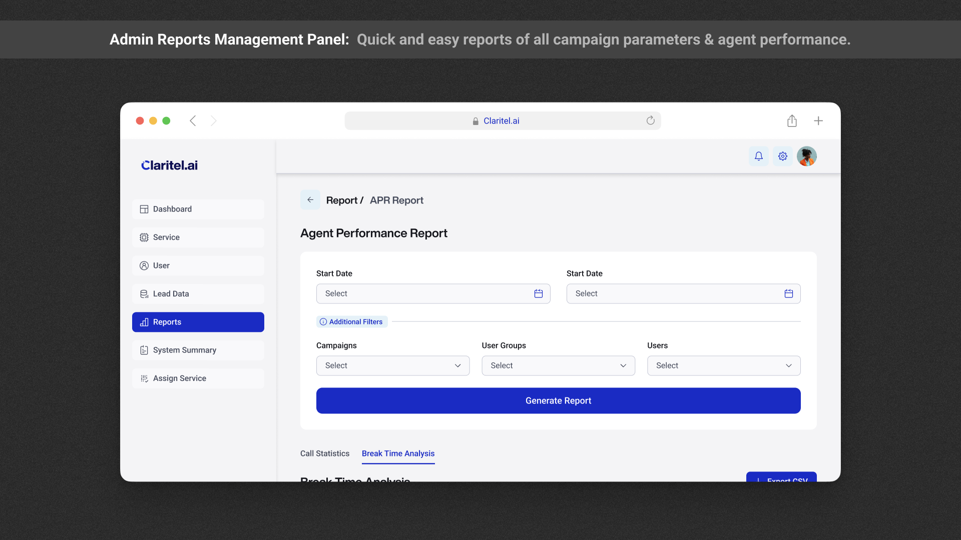
04. The Strategic Pivot (Kill Your Darlings)
The hardest part of design is deciding what not to build. We initially planned a dashboard full of rich, AI-driven data visualizations (charts, trend graphs).
The Rationale: The immediate user need was tracking agents, not analyzing long-term trends yet. By cutting the charts, we saved critical engineering days and started billing customers sooner.
05. Brand Identity: Humanizing the AI
B2B Telecom tools often look robotic and cold. To differentiate, I positioned Claritel as the "Human" AI.
- Visual Language: Used rounded corners, soft shadows, and a "Trust Blue" palette to counter the legacy feel of competitors.
- Full Stack Design: I designed and built the marketing website myself in 5 days, ensuring the brand story was consistent from the ad to the app.
06. The Business Impact
- Velocity: Went from Concept to Live Product in exactly 4 weeks.
- Revenue: The cohesive design and clear UX helped the founders demonstrate value, closing ₹5,00,000 in initial business contracts immediately post-launch.
- Scalability: The V1 "List-based" architecture successfully laid the foundation for the V2 roadmap.
Let's talk.
Have a project in mind? Send me a message and I'll get back to you within 24 hours.